
I have researched for a few 3d scene pictures. I think they all look very nice and realistic.
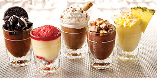
The first little shot glasses desserts are very cute and i like the composition 3 in front and 3 at the back, also they are very colorful and attractive. I think the lighting and texturing are very hard to do because i don't know how to do the cream texture. It seems very hard to make light shadows. The camera is very close to the object.
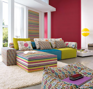
The second picture is the interior design. The sofas are very colorful and the modeling seems easy to do but the textures are hard especially for the carpet and also the natural lighting will take a lot of time to do i think. The camera is far away so it can show the whole scene.
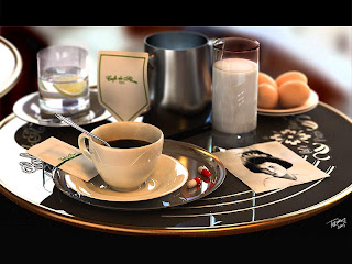
The third picture is the one i will create in Maya. I think the composition is interesting and i like the camera's depth for this image. The back objects are all blurry and the objects closer to the camera are very clear. The colors are very nice. I think the natural lighting will be very hard to do and also the reflection from the glass but it's challenging and i think i will take the challenge!!
The fourth picture makes me hungry and i think the modeling is not easy and the texturing seems difficult to do. The composition is simple and the color is mainly red. I think the lighting will be hard to do as well but this time it's indoor. The lighting will be different.
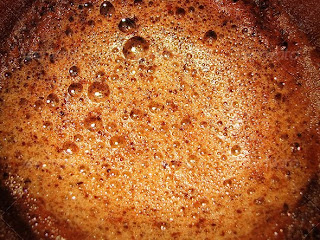
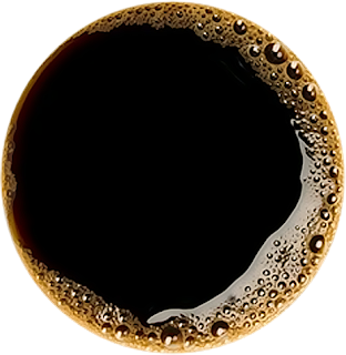
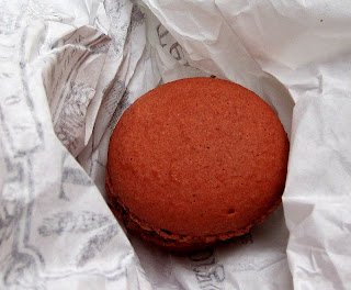
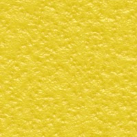
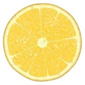
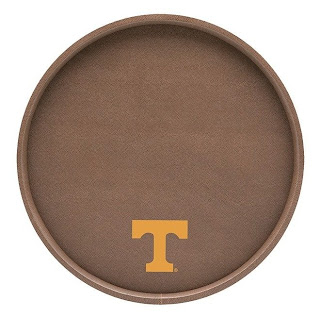
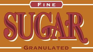
The textures i have collected are below.
Images Reference:
http://www.fridays.com.my/img/desserts/menu-pic-dessert-minis.jpg
http://www.id-renovation.com/web_images/interior-design_pic.jpg
http://www.3dm3.com/tutorials/cafe/cafe_final.jpg
http://www.fallingpixel.com/products/9514/mains/000-3d-model-Hamburger%2001.jpg
http://lordofdesign.com/ancient-patterns-gold-silver-ai/
http://farm3.static.flickr.com/2577/4204238417_683f3fe3c8.jpg
http://www.cafecafesantafe.com/images/Cafe%20Cafe%20logo%20final.jpg
http://s3.envato.com/files/133956.jpg
http://i5.photobucket.com/albums/y152/Dthsix6six/CoffeeColor.png
http://www.pjhanleysnyc.com/old-paper-texture.jpg
https://blogger.googleusercontent.com/img/b/R29vZ2xl/AVvXsEghNmzdQDcag1TqOV2ia3IrRvhOqgo5HcMphPtA8QmWyWfArbN8Qv7Nuc_GfQUysQzYYwIdCPkc0rUhrVGw2DRr1Cxgh6KCi1_HKiYy6-IcitqcmdhflC38LWewVCO_RgMaoLalN4fworyQ/s1600/paris%252C+first+macaron.jpg
http://farm3.static.flickr.com/2671/4116012389_8fc171c34e.jpg
http://impactinit.assetsdelivery.com/thumbnails/sav/sav0807/sav080700038.jpg
http://www.logodesignworks.com/blog/images/hard-rock-cafe-logo-design.jpg
http://www.ivgstores.com/prodimages-cdls/Krt/krt-20630f-L.jpg
http://www.templates.com/blog/wp-content/uploads/2010/07/The-Sugar-Bag-Effect-Photoshop-Tutoriall.jpg
http://www.psdgraphics.com/file/stainless-steel.jpg
http://fc09.deviantart.net/fs43/f/2009/057/f/5/Old_Scroll_Texture_II_by_Isthar_art.jpg

 This is my scene. I finished modeling and i changed the eggs to macaroons!





 This is my final scene. I did bump map on the castle and also the house. I did some research for the castle and i think castle should have this kind of texture. I also search the tutorial about glow effect in maya. In the end i use the ambient color for the glow effect for the windows.
 I learnt how to model a realistic eyeball from this website and I think it's not hard but looks really good. I don't need any textures for the eyeball only using the ramp attribute plus fractal. I think fractal is very useful.