Wednesday, June 15, 2011

week14


i posted the original picture and my different lighting pictures for my final scene

references:

http://d2f8dzk2mhcqts.cloudfront.net/0457_Create_a_Realistic_Paper_Texture/final-2-large.jpg


http://www.society6.com/product/The_Big_Lebowski_Print/60807?tag=design-milk&utm_source=pubnet&utm_medium=banner&utm_content=&utm_campaign=pubnet-collection&curator=designmilk


http://www.freshfreestuff.net/free/shutterstocks-free-vector-flower.html


http://image.shutterstock.com/display_pic_with_logo/64543/64543,1154239457,1/stock-vector-decorative-lines-1612034.jpg


http://www.sycha.com/wp-content/uploads/2010/03/Paper-106.jpg


http://d2f8dzk2mhcqts.cloudfront.net/0457_Create_a_Realistic_Paper_Texture/final-2-large.jpg

Wednesday, May 25, 2011

week11


This is my scene. I finished modeling and i changed the eggs to macaroons!

Tuesday, May 24, 2011

week10: 3d realistic scene


I have researched for a few 3d scene pictures. I think they all look very nice and realistic.
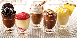
The first little shot glasses desserts are very cute and i like the composition 3 in front and 3 at the back, also they are very colorful and attractive. I think the lighting and texturing are very hard to do because i don't know how to do the cream texture. It seems very hard to make light shadows. The camera is very close to the object.
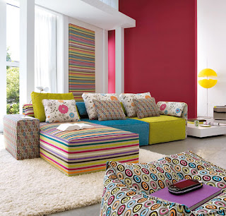
The second picture is the interior design. The sofas are very colorful and the modeling seems easy to do but the textures are hard especially for the carpet and also the natural lighting will take a lot of time to do i think. The camera is far away so it can show the whole scene.
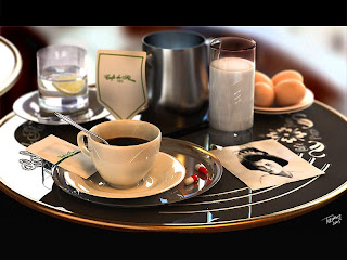
The third picture is the one i will create in Maya. I think the composition is interesting and i like the camera's depth for this image. The back objects are all blurry and the objects closer to the camera are very clear. The colors are very nice. I think the natural lighting will be very hard to do and also the reflection from the glass but it's challenging and i think i will take the challenge!!
The fourth picture makes me hungry and i think the modeling is not easy and the texturing seems difficult to do. The composition is simple and the color is mainly red. I think the lighting will be hard to do as well but this time it's indoor. The lighting will be different.

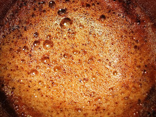
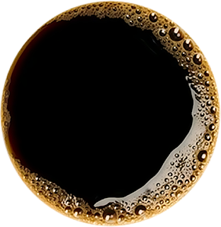
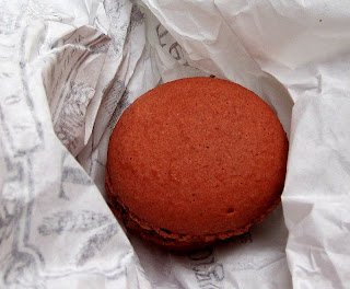
The textures i have collected are below.

Images Reference:
http://www.fridays.com.my/img/desserts/menu-pic-dessert-minis.jpg
http://www.id-renovation.com/web_images/interior-design_pic.jpg
http://www.3dm3.com/tutorials/cafe/cafe_final.jpg
http://www.fallingpixel.com/products/9514/mains/000-3d-model-Hamburger%2001.jpg

http://lordofdesign.com/ancient-patterns-gold-silver-ai/
http://farm3.static.flickr.com/2577/4204238417_683f3fe3c8.jpg
http://www.cafecafesantafe.com/images/Cafe%20Cafe%20logo%20final.jpg
http://s3.envato.com/files/133956.jpg
http://i5.photobucket.com/albums/y152/Dthsix6six/CoffeeColor.png
http://www.pjhanleysnyc.com/old-paper-texture.jpg
https://blogger.googleusercontent.com/img/b/R29vZ2xl/AVvXsEghNmzdQDcag1TqOV2ia3IrRvhOqgo5HcMphPtA8QmWyWfArbN8Qv7Nuc_GfQUysQzYYwIdCPkc0rUhrVGw2DRr1Cxgh6KCi1_HKiYy6-IcitqcmdhflC38LWewVCO_RgMaoLalN4fworyQ/s1600/paris%252C+first+macaron.jpg
http://farm3.static.flickr.com/2671/4116012389_8fc171c34e.jpg
http://impactinit.assetsdelivery.com/thumbnails/sav/sav0807/sav080700038.jpg
http://www.logodesignworks.com/blog/images/hard-rock-cafe-logo-design.jpg
http://www.ivgstores.com/prodimages-cdls/Krt/krt-20630f-L.jpg
http://www.templates.com/blog/wp-content/uploads/2010/07/The-Sugar-Bag-Effect-Photoshop-Tutoriall.jpg
http://www.psdgraphics.com/file/stainless-steel.jpg
http://fc09.deviantart.net/fs43/f/2009/057/f/5/Old_Scroll_Texture_II_by_Isthar_art.jpg


Tuesday, May 17, 2011

week 9: lamp animation


I found this tutorial but it's not for maya. The lamp animation is done in camera 4D but i think it's similar to maya. The rigging part seems a little confusing for me. I understand that when moving one handle, the other handles will move as well. The animation is not that hard once the rigging is finished.


Reference from: http://cg.tutsplus.com/tutorials/maxon-cinema-4d/create-a-jumping-lamp-animation-in-c4d-day-1/
http://cg.tutsplus.com/tutorials/maxon-cinema-4d/create-a-jumping-lamp-animation-in-c4d-day-2/

Tuesday, May 3, 2011

week 8 : final scene


This is my final scene. I did bump map on the castle and also the house. I did some research for the castle and i think castle should have this kind of texture. I also search the tutorial about glow effect in maya. In the end i use the ambient color for the glow effect for the windows.


reference source: http://www.trentbaird.com/3D/castle.html
http://free-pictures.dailypictures.info/free-pictures/113/3D-graphics_Sky_castle_005120_.jpg

week 7 journal: ocean shader


I tried to do a lake in my scene and i watched this tutorial of how to create water but after that i realized it didn't look like a lake, it looked more like the ocean. so i changed it to a flat surface with reflection on it but the result i think it looked more like a mirror....

week 6 journal: Modeling eyes

I learnt how to model a realistic eyeball from this website and I think it's not hard but looks really good. I don't need any textures for the eyeball only using the ramp attribute plus fractal. I think fractal is very useful.

tutorial from:
http://www.spafi.org/index.php?option=com_content&task=view&id=449&Itemid=29


I have done the rabbit modeling in this week.

Sunday, April 3, 2011

week 5 journal


I have watched the tutorial of how to create a pumpkin in maya. After i watched this video i think pumpkin is not hard to create at all. I learnt a few things, using Hull and trim tool are the new things i learn from this tutorial. I think trim tool is very useful.

week 4 journal


I have done some sketches for my characters and scenes. I have decided to make the rabbit and the pumpkin car scene.

Saturday, March 19, 2011

week 3 journal


I have been thinking which scene should i create and i have done some research on google.
I am thinking to do a cafe or some disney style scenes like the mushroom house or the snow white house. I think i will go for the disney style house because it is suitable for my character and I think it would be very cute. I will start to do some sketches for the house. 

reference: http://www.tourism.vic.gov.au/piecesofvictoria/september_2009/i/Lindt%20Cafe.jpg
http://farm4.static.flickr.com/3021/3078679595_a1731b23bc.jpg
http://www.alexross.com/DC4%20Cleaning%20House.jpg

Tuesday, March 15, 2011

week 2 journal


I have done some sketches for my character and i am thinking to use the cat with pants for my character and i gave it a name called "nico". I am also deciding what scene should i do for assignment 1. I really like this cat and i will give him some characteristics and develop with colours.

Sunday, March 13, 2011

week 1 journal

When I started to do modeling. I found that mouth is difficult to model. I kept extruding but it became more complicated. I watched a video on youtube about how to create mouth in maya. In the tutorial, the mouth is done without extruding and it seemed a little difficult for me. It's a different way of modeling and the lines are very clean and neat. 
I will try to practice how to create a mouth in maya.

video source: http://www.youtube.com/watch?v=_roAfYhOzKU&feature=related